 my
myPantone and Dulux Colour of the Year 2022 – Decoration Trends
Around the middle of December, both Pantone and Dulux announce their colour of the year. It's an inspiring time in home renovation, as these colours will set the trend for colours we can expect to see on the high street and in our homes for the year ahead.
You are either a colour fan like me, anticipating the announcement of this year's colour, or you will wait to see what happens. Either way, I hope this year's colours will inspire you and give you a new brighter feeling for the new year ahead.
Both Pantone and Dulux spend time deciding the feelings the colour will evoke. They are deciding and looking at other trends or events happening during the year to come up with a new colour that can give a refreshing new look.
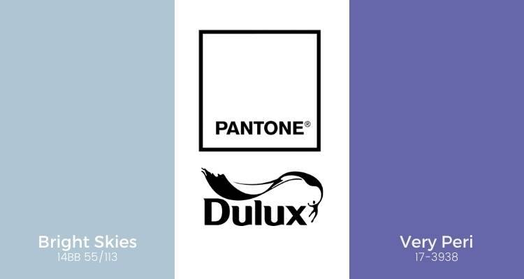
Pantone Colour of the Year 2022
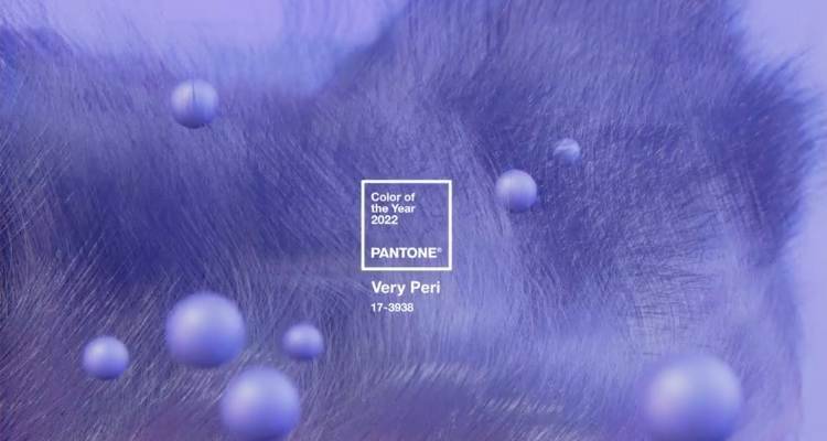
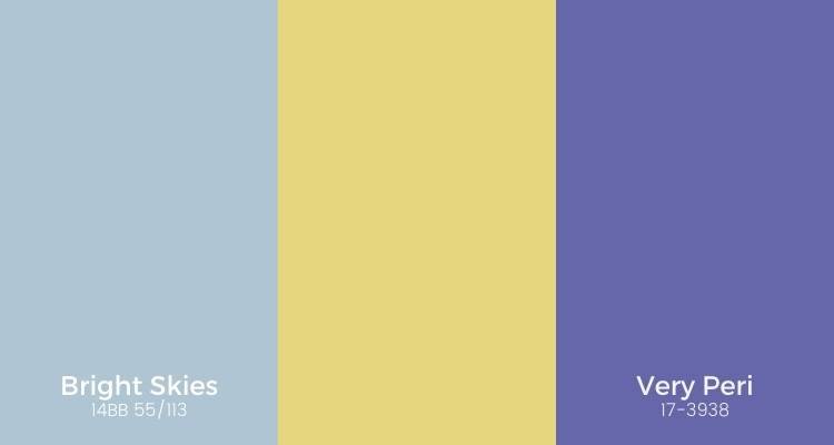
Pantone has named Very Peri 17-3938 their colour this year. They describe this colour as "carefree confidence and a daring curiosity that animates our creative spirit". Pantone goes on to say it is also "is a symbol of the global zeitgeist of the moment and the transition we are going through."
While Very Peri is the name given, it's a deep purple. Very Peri is a colour that combines the calming shade of blue and the intensity of Red. Purple is also associated with royalty and wealth. So as 2022 is the Queen's platinum jubilee, it feels like a very natural choice for Pantone Colour of the year 2022.
Find out more on the Pantone Website https://www.pantone.com/uk/en/color-of-the-year-2022
Decorating with Pantone Very Peri Colour of the Year

While purple is more warming than blue as a colour, you do have to be careful not to go overboard and decorate everything in one colour. This is true for all colours, but especially with this shade of purple.
Use too much colour, and your home can go from feeling light and welcoming to very dark. Meaning you will be less likely to feel happy there or want to spend time in the room.
Here are some ideas for your home
(insert images)Dulux Colour of the Year 2022
Every year the team of experts at Dulux discuss global trends that affect all of us. They then use the data they gather to choose the colour of their year.
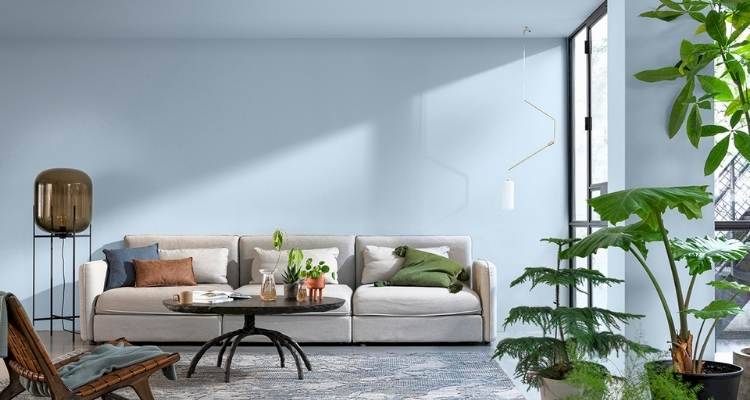
For 2022, Dulux has named Bright Skies their colour of the year. Dulux describes their colour of the year as "light and uplifting". Something we all seem to need a little more of in our lives at the moment.
Dulux describes their choice as "An airy, light blue that's fresh, open and invigorating" and that it "reflects the limitless skies around us." Combining the Dulux colour of 2022 Bright Skies with Cliff Walk gives you a very retro beach hut feeling. It gives you the feeling of being outdoors, even when indoors.
Find out more on the Dulux website https://www.duluxtradepaintexpert.co.uk/en/content/dulux-colour-of-the-year-2022
Decorating with Dulux Colour of the Year 2022
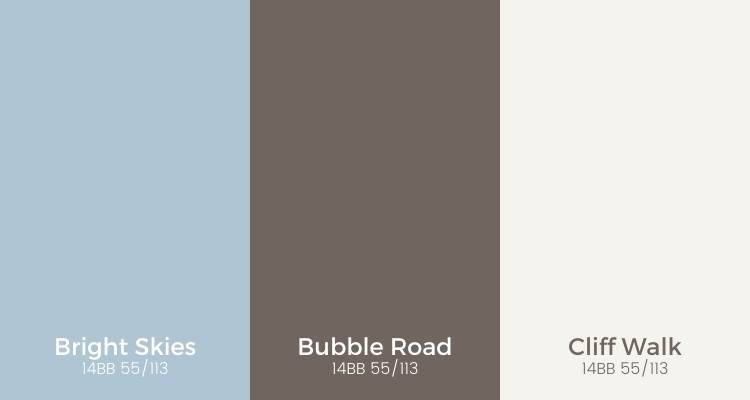
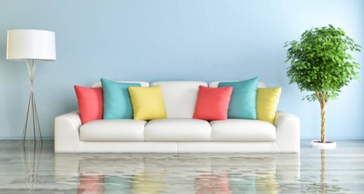
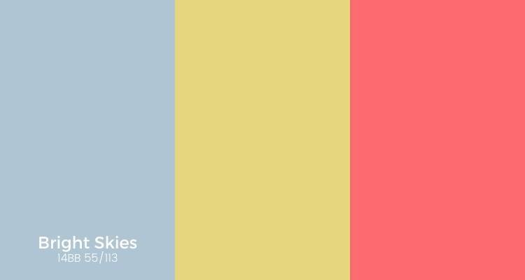
Bright Skies is a bright colour that gives you as a homeowner the opportunity to combine with either Bubble Road or Cliff Walk for a very retro feeling. But equally, you can combine Bright Skies with bright, bold colours and accessories.
With the wide choice of colour combinations available with Bright Skies, it's possible that the overall popular colour of the year could be Dulux.
Using Both Dulux and Pantone Colour of the Year 2022
While it seems that Dulux is more adaptable, both Dulux and Pantone Colour of the year 2022 seem to compliment each other with this lime/yellow tone.
What do you think? Will you be upgrading and decorating your home with either of this year's choices for the colour of the year? Which one inspires you most? Please share this post with your friends and see what they think.
Last updated by MyJobQuote on 14th December 2021.